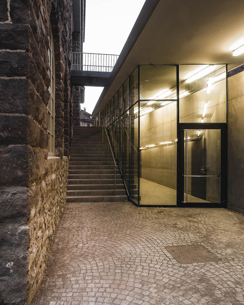
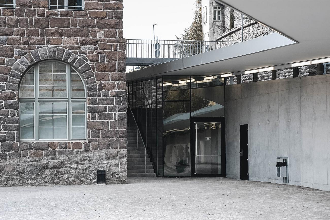
In the early 1900’s the Antonio Rosmini Primary School was founded in Gries. In one of the oldest quarters in Bolzano, both the kindergarten and the primary school rose in the shadow of the old Gothic parish church. A hundred years later, the project for the refurbishment and enlargement of the school complex involves respecting the existing architecture without altering its character.
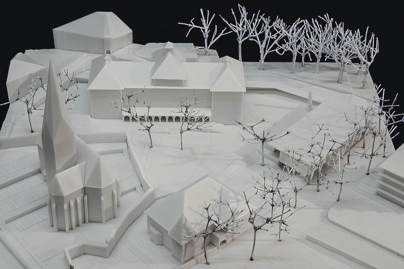
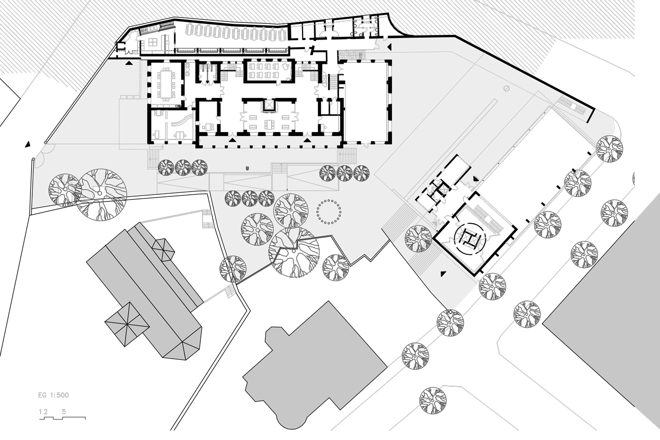
The layout of the old and new buildings is designed to create a complex with the large courtyard at its centre. As with the old cemetery next to the church, when the school gates are open the complex is traversable using the purpose-made multi-level access through the neighbourhood.
This regeneration project was developed through craft experimentation. In this case, digital methodologies make way for traditional studio models, enabling specific choices thanks to the ability to better visualise and contextualise all aspects of the project. The model illustrates the materials used, aesthetics and various details. This model is a surprisingly effective tool for developers.
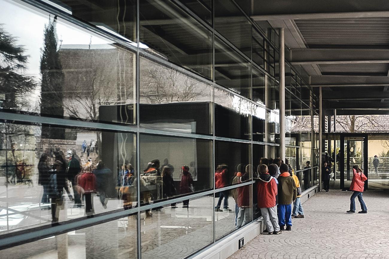
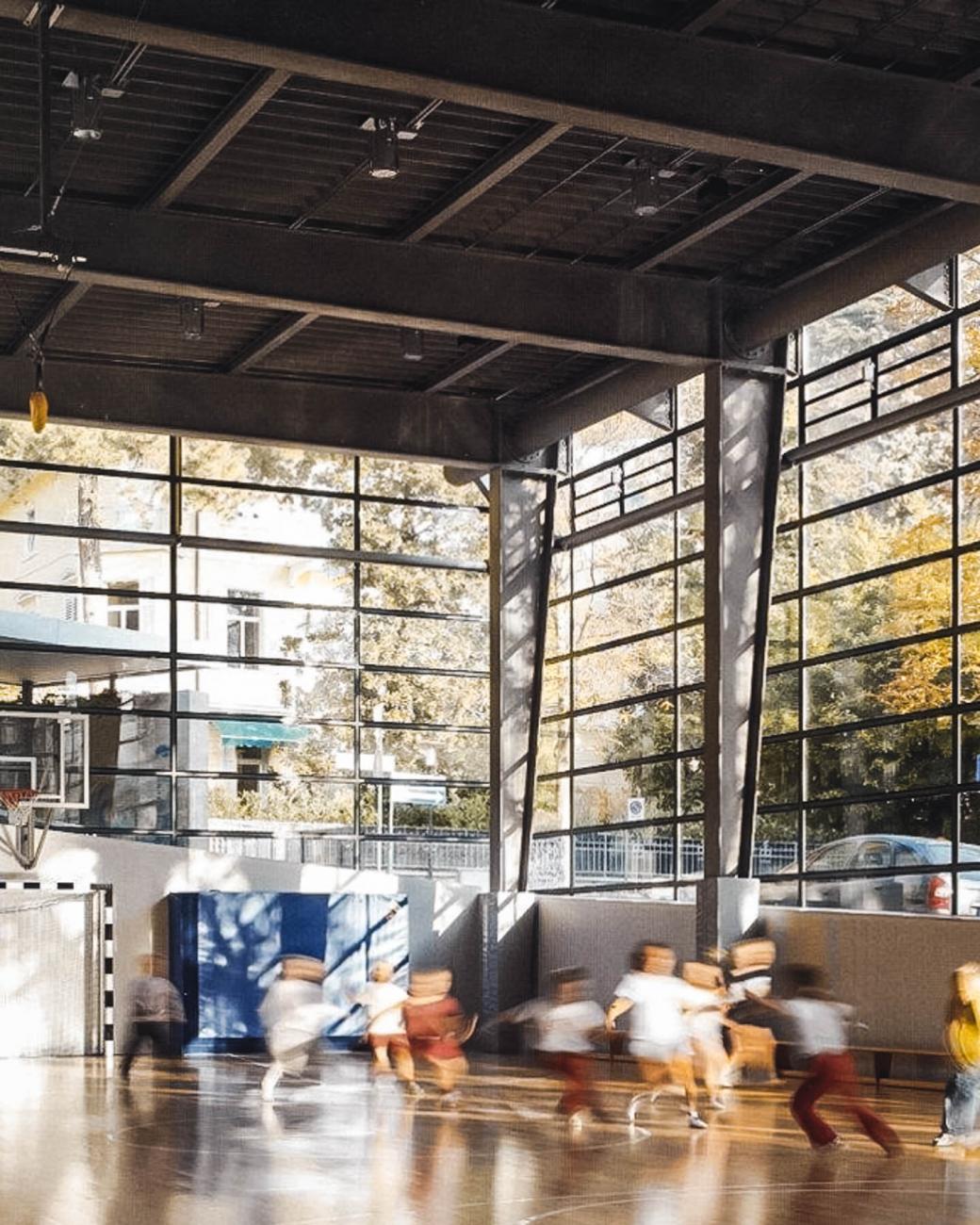
The new gym offers ample transparency thanks to the liberal use of glass. The wide, tall facade interplays with the exterior by allowing the infiltration of natural light, while looking out on the age-old chestnut trees. Like a transparent expanding skin, the smooth glass façade is without structural profiles. It is mostly a suspended structure, designed to adapt to different external stresses. For the pupils, the gymnasium and its surroundings is experienced as one contiguous environment.
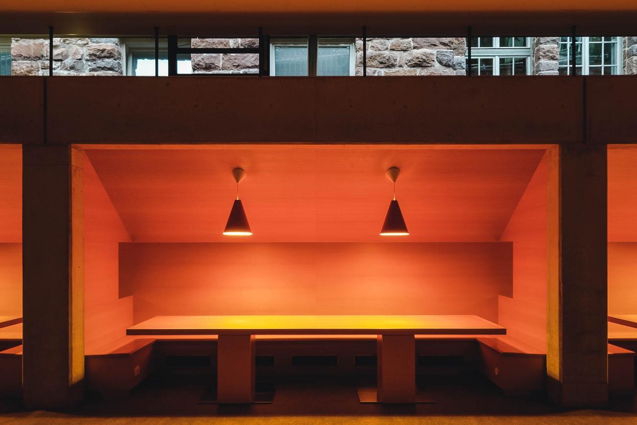
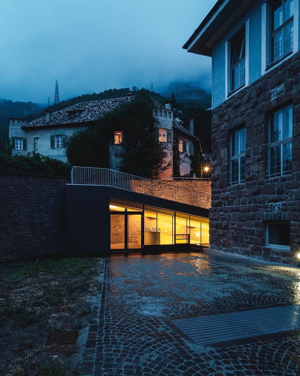
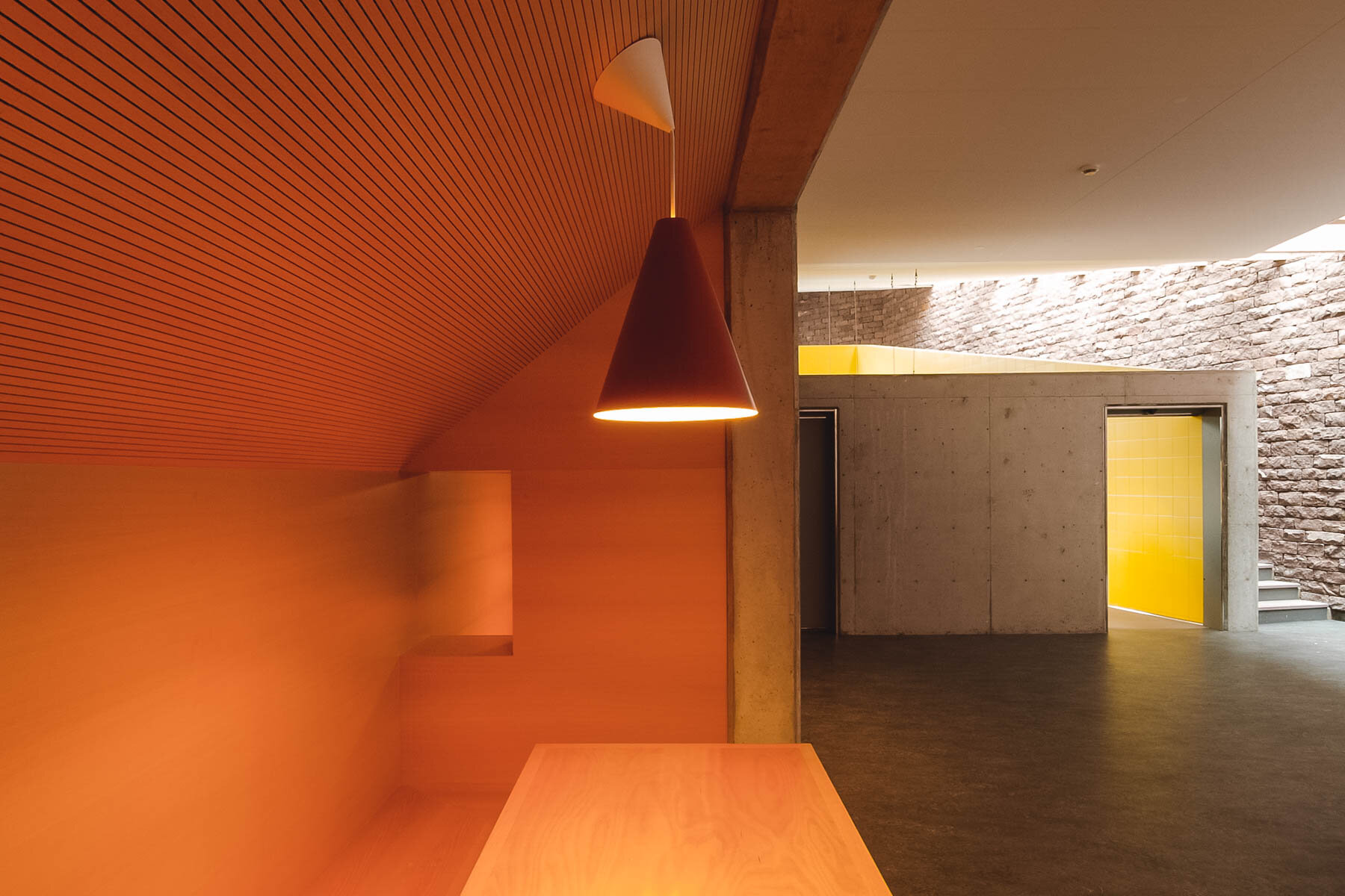
Between the rear of the school, with a wall separating it from the road the underground canteen serves as a communal meeting place. The canteen could thus be accommodated, without interfering with the large central courtyard. The underground areas directly connect to the main school building while remaining separate. This congenial wood-cladded ambience beneath the retaining walls with large central tables, can seat up to 160 students and teachers. The open window kitchen is located at the head of the canteen and can be observed from different angles. If the architecture of the Rosmini School gym is generally influenced by the prevalence of glass, down in the canteen it is the porphyry that dominates. Down here, the large stone surface is prevalent, emphasised by the natural zenithal illumination.
